
Flower by Kenzo Cherry Poppy: the complete profile A new chapter for the urban flower Since its birth in 2000, Flower by Kenzo has embodied the idea of a delicate flower growing in the heart of concrete, spreading its poetry across the city. Twenty-five years and around fifteen editions later, the saga takes a gourmand-floral turn named Cherry Poppy. This eau de parfum, planned for summer 2025, fuses the airy freshness of a poppy petal with the juicy sweetness of a fully ripe cherry. The ambition: to bring together two symbols of fleeting beauty—the wild flower that resists everything and the red fruit that lasts only a moment—to compose a signature that is at once joyful, sensual and resolutely contemporary.
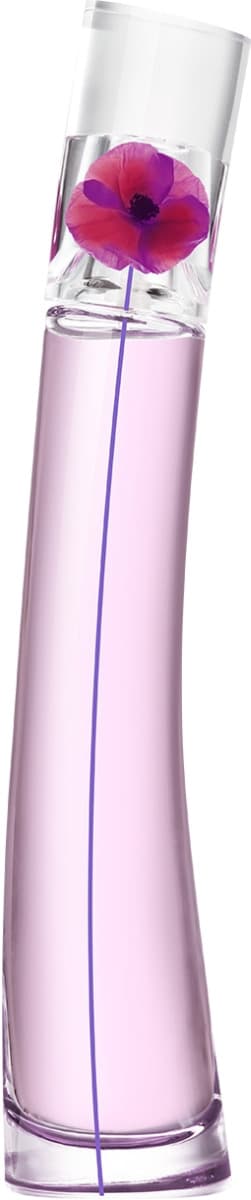
Bottle: the cherry-poppy that colors the skyline The urban pebble becomes a pulp column Since 2000, the Flower line has been recognized by its slightly curved cylinder, like a poppy stem trapped in glass. For Cherry Poppy, the designers keep this slender column—a nod to the Parisian skyscrapers that inspired Kenzo Takada—but play the gourmand card: the base rounds into a plump drop then narrows as it rises, creating the illusion that the juice weighs on the glass like the flesh of a cherry on its branch. Seen from the side, one can even make out a slight flat facet: it ensures stability on display while recalling the mark left by a bitten fruit.
Cherry-red gradient: from pulp to petal
The inner lacquer moves from a deep ruby, almost black at its thickest point, to a translucent raspberry pink toward the neck. This transition symbolizes the fragrance's dual identity: juicy pulp (cherry) + airy lightness (poppy). Under natural light, the bottle casts a pink halo that colors the surrounding surface—a perfect trick for “unboxing” videos on TikTok or Instagram: a single ray of sunlight is enough to make the whole piece sparkle.
Design details: signature elements & ergonomics
Revisited poppy stem
The screen-printed stem keeps its iconic pistachio green, but its pistil is tinted a redcurrant pink, a direct echo of the fruit. When the bottle is turned, the stem seems to ripple through the ruby liquid; this optical effect creates a permanent movement, like a poppy dancing in the wind of the avenues.
“Poppy Seed” cap
The transparent, slightly curved cap now houses an internal anthracite disc dotted with micro silver points: the idea is to recall the dark seeds discovered when shaking a poppy pod. This detail adds a shadow/light contrast and eases alignment when closing thanks to a tactile marker.
Grip & “Cherry Cloud” spray
The smooth edges allow a “colored pencil” grip: the spray is pressed with the fingertip while drawing a broad gesture, as if tracing a red streak in the air. The pump releases a very fine mist—Kenzo claims a 17% larger coverage area compared to the classic Flower—ideal for enveloping hair, scarf and neckline with a single click.
Materials & eco-design
Recycled glass, water-based lacquer
The bottle incorporates 20% PCR glass and a water-based lacquer free of aromatic solvents. The red pigments come from mineral compounds, avoiding any controversial azo dye. The result: a reduced carbon footprint and a ruby shine that does not fade over time.
Pop-art box, 100% FSC cardboard
The box reprises the iconic stylized poppy visual, but on a cherry-red background dotted with white polka-dots. The soft-touch varnish has been replaced with a water-soluble “peach skin” finish, offering a velvety feel while remaining easily recyclable.
Digital styling & photogenic appeal
Cherry Poppy was designed to be “Instagrammable”: • Placed on a windowsill, it acts as a rosy-red filter over the urban skyline.
• In flat-lay shots, the asymmetrical base creates round reflections recalling scattered fruit around the bottle.
• On video, rapid rotation reveals an almost hypnotic sorbet gradient, perfect for reels.