
Lacoste's adventure in perfumery began in 1984. At the time, the house imagined a fragrance intended for elegant athletes in search of comfort and well-being. Then, many other perfumes followed, such as Booster in 1996 or Lacoste pour Homme in 2002.
The Lacoste house has always shown its deep attachment to the world of tennis, and for good reason: its founder, René Lacoste, was a former professional tennis player. Since 1933, he reinvented himself as a businessman, first giving birth to a ready-to-wear line before making his mark in perfumery. In 2020, blending the world of scents with that of sport, Lacoste gave birth to a perfume named Match Point. Presented as a bold and dynamic fragrance, it is built around notes of basil and gentian, further enhanced with woody flavors and a few spices. So what about its bottle? Here is the precise breakdown of its bottle
The dominant green color of the Match Point bottle
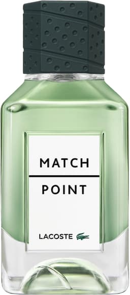
The first thing that catches the eye when looking at the Lacoste bottle is its green color. Indeed, even though its bottle is made of transparent glass, it lets us glimpse a colored fragrance, whose hue is even reflected in its rounded base. If Lacoste chose green, it is no coincidence. Indeed, it is also the color attached to its logo since the house's creation: the crocodile. As a reminder, the crocodile was also the nickname given to René Lacoste when he played on tennis courts. Moreover, green is a symbol of hope and energy. Finally, it alone evokes the world of sport, and more precisely certain tennis courts such as that of Wimbledon.
The unusual shape of the Lacoste bottle
Match Point also has a silhouette all its own. Its shape makes it easy for a man's hand to grip, with a wide, sturdy body narrowing at the neck. Its glass base, meanwhile, is quite wide. Its edges are slightly beveled. However, the real surprise comes at its base. It takes on a concave shape, as if a tennis ball had emerged within its glass walls. Undeniably, Lacoste echoes the world of tennis. The ball seems to leave its mark on the ground.
The Match Point cap, a racket handle
Because tennis is present in every element of this bottle, it is also present on its cap. It takes on a black color that contrasts sharply with the transparency of its base. Stitching appears here and there, clearly recalling the look of a racket handle. Here, it is an exact replica of the handle of René Lacoste's racket, which was in fact stitched with a few green elements in his time. This bottle is decidedly designed down to the smallest detail, and all its elements echo one another…
The neat white label of Match Point
Finally, a white label decorates the front face of this bottle. Behind its apparent simplicity, it is split in two by a black line. It thus evokes the look of a tennis court divided by the net. Others see in this taut black line a nod to the rising tension during a final match point. Finally, at the bottom of this label, the Lacoste name appears alongside the house's iconic crocodile.
The Match Point bottle comes in two sizes, 50 ml or 100 ml.